The moment website visitors enter your website, they’ll start organizing everything they see in order to make sense of it all. As a designer of websites you’re responsible for organizing the information in a way the message gets across in a proper way.
When a designer fails organizing the information on a certain web page, the message can be misunderstood or not understood at all. ‘Communication involves much more than knowing what to say; it also involves knowing how to say it.’ says Stephen Few in his book Show me the Numbers.
Gestalt principles to group information
Dutch article about Gestalt principles
When you’re able to read Dutch you should defininately read this article about gestalt laws in Usabilityweb Magazine.
Once you’ve decided which information belongs together, you need to decide which visual instrument you want to use to communicate a certain chunk of information as a group. During my presentation at a Fronteers meeting last year I talked about the gestalt laws of perception. I explained how they can help you make design more measurable.
Not many designers understand how powerful these gestalt tools are when used properly. Choosing the right approach is crucial when communicating information. Some tools are more effective than others, but sometimes the more effective approaches are more cluttering and distracting as well. In my opinion the proximity and continuity approaches are much underestimated.
Proximity law of gestalt as the most simple approach
The law of proximity says items placed near one another are distinguished as a group. This means we don’t need any other visual cues than the information itself to communicate it is a group. This simple approach allows its spectator to focus on the data without being distracted by anything else.
In his book Webform design: Filling in the blanks, Luke Wroblewski describes how minimalistic design simplifies web forms. Simply grouping labels and input fields by placing them near one another have more effective webforms as a result.
 Grouped submenu items
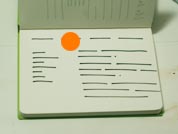 Grouped main menu items
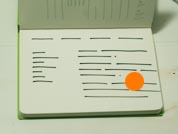 Grouped content
Continuity approach to strengthen perception of grouped items
The law of continuity says items placed in a certain row or direction are seen as a group. In the examples above you see the vertical main menu items and horizontal submenu items are placed near one another but are placed in a row as well. The perception of grouped items is strengthened by the law of continuity.
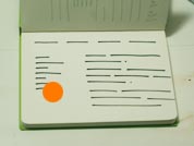
Continuity law to create hierarchy
 Law of continuity used as a design tool for a submenu
In the example below I show how the continuity approach also helps placing hierarchy in the submenu which I’ve sketched in my brand new Archie Grand notebook. Simply be jumping the subsubmenu items a few pixels to the right and placing them a little closer to one another we distinguish them as a subgroup.
Keep it simple
Once you’ve finished experimenting with the proximity and continuity tools you should evaluate whether the information you show (in my case a submenu, but this goes for tables, whole page layouts and web forms as well) can be easilty percieved and understood. Try not to use too many different design instruments at the same time as this will distract the user from the real information. Only add extra visual cues when necessary.